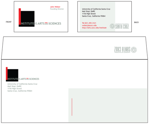
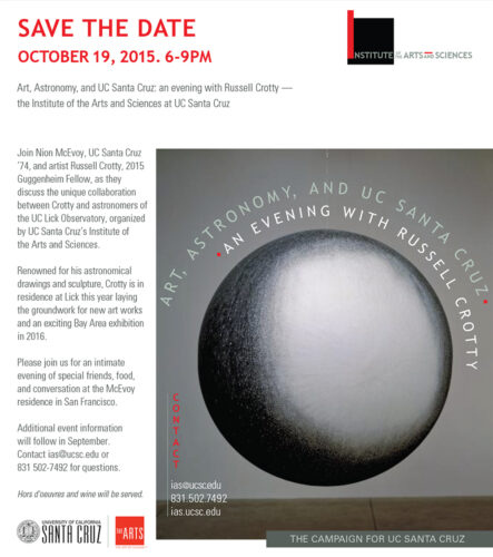
BRANDING
![]()
Solid black square represents the weight and prestige of a museum, while the red bar doubles as the letter “I.” Important words are larger, smaller words are stacked making typography more unique and the linear form more compact. Through groundbreaking, national-caliber art exhibitions and social justice initiatives, the IAS creatively educates students and the public about urgent issues impacting our society.
![]()
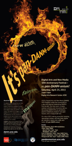
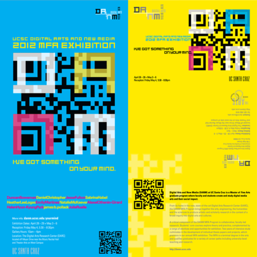
Logo for innovative, multimedia masters program, Digital Arts + New Media, has elemental, digital feel. Letters balanced over an extended plus sign create tension and separate name breaks. The blurred “n” adds to screen feel.

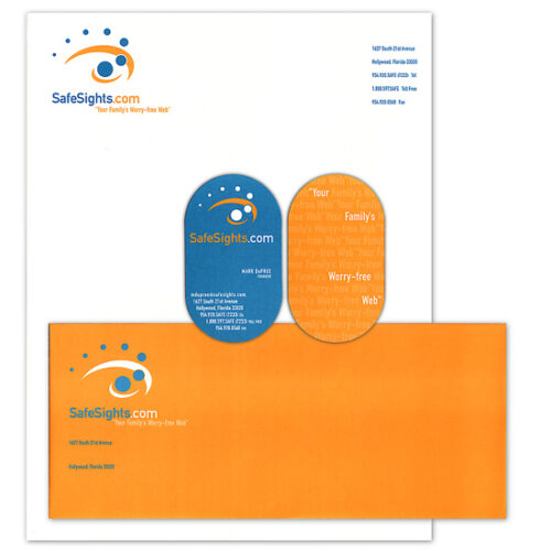
This logo for an internet filter company uses dots in motion and an abstract eye sights to depict which sites are permitted be seen.

![]()
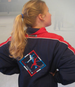
Incorporating dramatic movements of skaters with a figure eight, a pattern used by skaters develop proficiency in gliding on different edges, The Miami Figure Skating Club logo reprents a club that serves skaters of all ages and skill levels, from beginners to elite competitors.
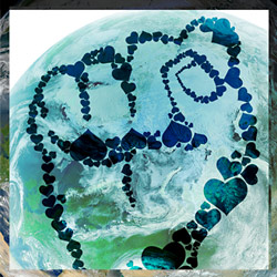
A fist made of hearts embodies activist power and love; layering effects over the earth image add softness, beauty and fragility.
![]()
By placing the letters above and below the gray block, the logo refers to buried artifacts at an archaeological site. Colors coordinate with the UC branding system. The UC Santa Cruz Archaeological Research Center advances a 21st century archaeology that situates a scientific and historically grounded archaeology within a context of community engagement and public outreach.arc.ucsc.edu

![]()


By putting Critical in red, and breaking the name into meaningful parts: Sustain and Abilities, the logotype functions to make a long name more intelligible, memorable, and deep by implying multiple meanings.
Branding and web design. critical-sustainabilities.ucsc.edu/ offers tools—in the form of keywords, sites, and projects—that can help us make sense of the multiple sustainabilities circulating today, and engage with the concept in more critical, creative, and powerful ways.
Playfully engaging viewers by challenging them to decode it, this logo for a graphic design and research company makes words easier to find by the placement of color blocks.
![]()
The color red is a threat, while brown and green reference nature in this bold, straight-forward logotype, which offers clarity to an organization with a long name. The Center for Creative Ecologies provides a place to consider the intersection of culture and environment. Founded by T.J. Demos, its aim is to develop useful interdisciplinary research tools to examine how cultural practitioners—filmmakers, new media strategists, photojournalists, architects, writers, activists, and interdisciplinary theorists—critically address and creatively negotiate environmental concerns in the local, regional, and global field.

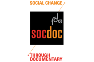
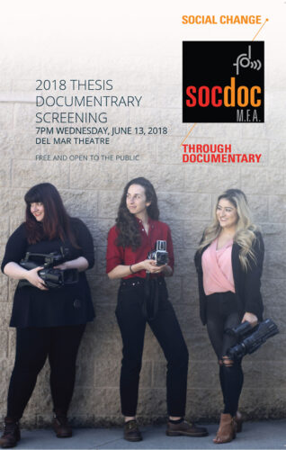
The “d” of cdar is animated for the motion of documentary film, bringing emphisis, variety and liveliness to simplicity of the mark. The Center for Documentary Arts and Research (CDAR) at UC Santa Cruz serves as a locus for experimentation and investigation of the social, aesthetic, historical, political and pedagogical capacities of documentary and nonfiction film and media forms and practices.
![]()
The yellow circle and gray bar of the logo form an abastract, lower case“a.” Overlapping, transparency, contrast and reversed type add interst and uniqueness to a simple form. The Arts Research Institute at UC Santa Cruz supports UC faculty, graduate, and undergraduate students involved in creative research, scholarship, and publicly-engaged practice.
![]()
Branding and web design. Vertical bars of the logo are visually rhythmic, relating to improvised music. ISIM promotes performance, education, and research in improvised music, illuminating the transformative impact of improvisatory creativity in education and society at large. improvisedmusic.org


![]()
The logo incorporates the wave sculpture, a well-known landmark of the college and UCSC. Porter College was founded in 1969 as the fifth of UC Santa Cruz’s residential colleges, and is especially dedicated to achievement in the arts, believing that creative inquiry is an essential part of a rigorous and broad-minded education, a flourishing society, and a happy life.